guide

How to customise

A short tour of where everything lives and how to make the template yours.​

Start here

Open Site settings → Forms and set the email that should receive the newsletter and enquiry forms.
Open Site settings → General and add your favicon and webclip.
Replace the placeholder photography (see Licenses).
Publish once to your webflow.io domain and click through every page before connecting a custom domain.

Colours, type, spacing and radii

Everything is a Webflow Variable, grouped in four collections: Base collection (colours), Typography, Spacing and Radius. Open the Variables panel (V) and change a value once to update every element that uses it.

Colour

Text/Primary #121212, with Text/Secondary, Text/Muted and Text/Subtle for quieter copy and Text/Inverse #FFFFFF on dark; Surface/Page #FFFFFF, Surface/Muted #F5F5F5, Surface/Dark #121212 and the other Surface tones; Border/Subtle #ECECEC and the other Border tints; Accent/Mint Green #51FEC0 (current-page marker); Feedback/Error and Feedback/Warning.

Type

Font Sizes/Body: Text XXS, Text XS, Text SM, Text MD and Text LG. Font Sizes/Heading: H5, H4, H3, H2, Display, H1 and Hero. All sizes are in rem, so they follow the visitor's browser text size, and headings step down automatically in the Tablet and Mobile modes. Font Sizes/Decorative holds the oversized background words. Font Weights: Light, Regular, Medium and Bold. Line Heights (percentages, tightest to loosest): 4X Tight, 3X Tight, 2X Tight, Extra Tight, Tight, Snug, Compact, Balanced, Medium, Comfortable, Open, Normal, Relaxed and Loose. Letter Spacing (em, tightest to widest): 4X Tight through Slight, Normal, then Open through 5X Wide. The base tags (Body, H1 to H6, Paragraph, Link, List, Ordered List, List Item, Block Quote and Bold) are styled with these variables.

Spacing

Fixed steps for padding, margins and gaps, smallest to largest: Spacing/2X Small, Extra Small, Small, Medium, Large, Extra Large, 2X Large, 3X Large, 4X Large, 5X Large, 6X Large, 7X Large, 8X Large, 9X Large and 10X Large. Each "Plus" step (e.g. Spacing/Medium Plus) sits halfway to the next step and is used for in-between gaps and paddings. Responsive values that shrink in the Tablet and Mobile modes: Spacing/Page Gutter, Section Small, Section, Section Large and Column Gap.

Radius

Radius, smallest to largest: 3X Small, 2X Small, Extra Small, Small, Medium, Large, Extra Large, 2X Large, 3X Large, Pill and Circle.

Font

Font Family/Primary (set to Switzer) for everything and Font Family/Rich Text (set to Inter) for long-form rich text on the legal, contact and journal pages. Both are installed as site fonts under Site settings → Fonts (see Licenses), so there is no font code to maintain — change either variable to swap the typeface site-wide.

Modes

The Typography, Spacing and Radius collections each have four modes — Base (desktop), Tablet, Mobile Landscape and Mobile Portrait. Webflow applies them automatically at the matching breakpoints, so the type sizes and responsive spacing above adapt on every device. To change a value for one device, edit that mode’s column in the Variables panel.

Components

Navigation, Footer, CTA Band and Bottom Bar live in the Components panel. Edit the main component once and every page updates. Buttons are components too (Buttons group): Button has Primary, Small and Dark variants with Text and Link props; Rounded Button has Dark and Light variants; Panel Button is the label on the home residence panels. Select an instance and pick a variant or edit its Text and Link in the right panel; never detach them.

Navigation — the logo, the three desktop links, the Pages dropdown (the .av-pages-panel grid inside the component), the Book a Call button, and the phone menu list. The logo is two SVG images, .av-nav-logo and .av-nav-logo-light; the script fades the light one in while the phone menu is open, so replace both with your own logo files.
Footer — newsletter form, link columns, contact details, social buttons, the moving wordmark (an SVG image, avenlo-footer-wordmark.svg — replace it in the Assets panel with your own name) and the copyright chip.
Bottom Bar — the floating pill that appears after you scroll; its panel links to the main pages.
CTA Band — the background photo (the image inside .av-cta-media: select it and pick another asset), the headline and the Book a Call button. The “A look around” section on the Property template is a still photo (the image inside .av-sr-box): select it to swap it, and keep the dark overlay on .av-sr-caption so the caption stays readable over any photo. Nothing on the site autoplays video.
The current page is highlighted automatically through Webflow’s current-link state — no editing needed.

Preloader

The loading screen is the #av-pre block at the very top of the Home page (Navigator: Preloader). It plays once per browser session on the Home page only, is skipped for visitors who prefer reduced motion, and the page never depends on it.

Logo — select the image inside .av-pre-lockup (class .av-pre-mark), open the Settings panel and choose your own mark from Assets. A square mark around 40 px looks best; give the new asset alt text in the Assets panel.
Text — double-click .av-pre-word to change the brand name and .av-pre-caption to change the caption underneath. Delete the caption if you only want the name.
Colours — the panel uses the Surface/Dark, Text/Inverse and Text/Inverse Subtle variables; the progress bar is #av-pre-bar and the counter is #av-pre-count. Restyle their classes like any other element.
Timing — the bar tracks real page load, holds for about a second and is capped at five seconds; the numbers live in the preloader part of the footer script (search it for #av-pre).
Remove it — delete the #av-pre block on the Home page. The script checks for it first, so nothing else needs to change.

Content

Properties — one item per home. Cover, two photos, location, price, size, bedrooms, status (For Sale / Under Offer / Sold), type (House / Apartment), the stats line, a lead sentence and a rich-text body. Every property card is a Collection List sorted by Order: the first three homes fill the Properties grid and the rest appear under More homes, while the Home page and agent pages show homes whose Status is For Sale. Add, edit or remove an item and every card updates on its own.
Services — cover, order, index label (01–07), heading, body, best-for, timeline, coverage, fees and six inclusions. On the Home and Services pages the first four services by Order are rows and the next three are cards; each service page lists all of them under Other services.
Agents and Journal Posts — portraits, roles, contact details and posts with cover images and rich text. The Agents grid, the About team slider and the Journal grid are Collection Lists, so new items appear automatically. Item pages live at /property/…, /agent/…, /service/… and /journal/….
Static pages (Home, About, Contact, Privacy, Mortgage calculator) are edited directly on the canvas. Rich-text bodies use heading, paragraph and list styles nested inside .av-jd-copy (journal posts) and .av-ag-copy (property descriptions). Both are on the Style guide under Rich text: select an element there to restyle every post or property description at once.

Breakpoints

The design has three layouts: desktop, tablet and phone. In Webflow the desktop layout lives on the 1280px-and-up breakpoint, the tablet layout runs from the base Desktop breakpoint (992–1279px) through Tablet, and the phone layout on Mobile landscape and portrait. Edit the 1280px breakpoint for desktop changes and the base breakpoint for tablet ones. There is no CSS in Page settings → Custom code — every width is a native Webflow style.

Hidden and collapsed elements

Some elements stay hidden or collapsed until a visitor interacts with them. Select them in the Navigator to edit them:

Pages dropdown (.av-pages-panel) and the phone menu (.av-nav-right), both inside the Navigation component.
Bottom Bar panel (.av-bar-panel), inside the Bottom Bar component.
FAQ answers (.av-faq-panel), collapsed to zero height until a question is opened.
Video lightbox (.av-vcard and .av-vbackdrop) at the bottom of the Home and Services pages.
Floor-plan panels (.av-fp-panel) on the Property template; the panel with the is-on class is the one shown first.
Testimonial slides 2 and 3 (.av-slide with is-hidden) on Home and About; remove is-hidden while you edit a slide, then add it back.
Preloader (#av-pre) on Home, hidden on the canvas; see Preloader above.
Form success and error messages: select a form and switch its State to Success or Error in the Settings panel.

How to Edit GSAP Animations

Avenlo's motion is split in two. Page intros, scroll reveals, parallax, marquees, the glass heading and the hover effects are native Webflow Interactions with GSAP: open the Interactions panel (the lightning icon in the Designer's left bar) to find each one by name and change its timing, ease or trigger. The logic-driven effects marked (script) below run on GSAP 3.15 (core, ScrollTrigger, SplitText, CustomEase and ScrollToPlugin) in one script in Site settings → Custom code → Footer code, and Webflow loads the library for you under Site settings → GSAP. The script is compressed to fit Webflow's code limit, so use the editor's search (Cmd/Ctrl + F) to jump to any snippet quoted below.

Element map

Page titles (native): the interaction "Page intro: title and hero reveal" fades in every page title word by word (.av-hero-word, .av-ab-word, .av-sv-word, .av-pr-word, .av-mc-word, .av-ph-word and the Journal post title) together with the hero eyebrows, buttons and images. The script starts it with the custom event av-intro once the preloader has finished.
Scroll reveals (native): the "Fade up on scroll" interactions animate every element with a data-reveal attribute. The value is the distance in pixels (10, 12, 14, 16, 18, 20 or 26; headings and paragraphs start a little later), and data-reveal="z" uses "Zoom in on scroll". The delayed variants are data-reveal="10" with data-d="300", "12" with data-d="120", and "18" with data-d="60", "80" or "120". To add a reveal, give an element one of these attribute combinations.
Parallax, marquees and scrubs (native): "Home hero parallax on scroll" (.av-skyline and .av-hero-meta), "Property card image parallax on scroll" (.av-pcard-inner), the marquee loops (.av-ticker-track, .av-logos-track, .av-quotes-track, .av-since-track, .av-strip-track and .av-wordmark-track, where the loop duration sets the speed), "Glass heading words brighten on scroll" ([data-scrub] .av-glass-word) and "Stage cards fade in on scroll".
Hover effects (native): card image zooms (.av-pcard, .av-apc, .av-post, .av-team-card, .av-ag-card), .av-btn labels, the Learn more and Subscribe label rolls, the index and team-slider arrows, and the .av-svc-row sweep and highlight. Each one is switched off on tablet and phone in its conditional playback settings.
Preloader (script): #av-pre on the Home page counts to 100, then slides up. It plays once per browser session and then fires the av-intro event.
Navigation (script): [data-menu-btn] opens the phone menu, [data-pages] the Pages dropdown, [data-bar] shows the bottom pill after you scroll and [data-back-top] scrolls back to the top.
Interactive blocks (script): [data-faq] accordions, [data-tabs] capability tabs, [data-fp] floor-plan tabs, [data-team] team slider and the [data-play] video lightbox.
Section effects (script): [data-panel] home property panels, the [data-stages] card drift and rings, [data-journey] About timeline, [data-wi] Work Index list, [data-sr] growing photo, [data-res] result chart, [data-draw] capability line drawing, the [data-slide] and .av-photo crossfades, the .av-hero-meta fade and the .av-svc-card widening on hover.
Layout helpers (script): the sticky [data-hero] offset on Home, the .av-pcard aspect ratios on Properties and eager loading for the images inside [data-marquee] tracks.
Mortgage calculator (script): [data-mc] reads the [data-in] inputs and [data-slider] ranges and updates the results, the ring chart and the year-by-year table.

Customising key variables

The script opens with one settings object. Change a value here to retune that effect on every page:

var K={drawDuration:.8,drawStagger:.18,drawStart:"top 85%",faqDuration:.5,slideInterval:5,photoInterval:4}
Duration: to draw the capability lines faster, change drawDuration:.8 to drawDuration:.6. faqDuration is the open and close speed of the FAQ accordions. Values are in seconds; keep them between 0.15 and 0.8. For a native interaction, select its action in the Interactions panel and change Duration.
Delay: drawStagger is the gap between the lines of each icon, and slideInterval and photoInterval are the seconds between photo crossfades. Native reveals take their delay from the data-d variant, or from the action's start time in the Interactions panel.
Ease: the script's eases are defined once as CustomEase curves, like the one below. Edit the four numbers, or replace the curve with a GSAP ease name such as "power2.out". The native interactions use the same curves as custom eases on each action.
ScrollTrigger: drawStart:"top 85%" starts the line drawing when the icons reach 85% of the window height. Use "top 70%" to start it later. Native scroll reveals set the same start in each interaction's scroll trigger settings.
Marquee speed and parallax: both are native now. A marquee loop's duration sets its speed (longer is slower), and the hero parallax moves the skyline up 180vh over six screen heights of scrolling. Change either in the Interactions panel.
CustomEase.create("avSoft","0.33,0,0.2,1")

The line drawing is a single tween that you can also edit in place:

gsap.to(n,{strokeDashoffset:0,duration:K.drawDuration,ease:d,stagger:K.drawStagger,scrollTrigger:{trigger:e,start:K.drawStart,once:!0}})

Removing GSAP animations

One element: select it, open Settings → Custom attributes and delete its data-reveal (or data-draw) attribute. The element simply shows in place.
One feature: delete a native effect in the Interactions panel (⋯ → Delete). For a script effect, open Site settings → Custom code → Footer code, search for its selector from the element map, for example [data-draw], and delete that function together with any scrollTrigger or ScrollTrigger.create code inside it. Each feature checks for its own elements first, so the rest keeps working.
All motion: delete the native interactions and the whole footer script, then switch GSAP off under Site settings → GSAP. If you keep the native interactions but delete the script, change the trigger of "Page intro: title and hero reveal" from Custom event to Page load, otherwise the page titles stay hidden.
Whichever you choose, save the custom code and publish the site.

Side effects: removed animations simply stop. Elements appear instantly in their final place and marquees stand still. The phone menu, Pages dropdown, bottom pill, FAQ accordions, tabs, video lightbox and mortgage calculator run on the script, so if you remove all of it, replace them with Webflow's native Navbar, Dropdown, Tabs and Lightbox elements or delete them.

SVG icons

The interface icons (menu, arrows, play button, social icons, ticks, quote marks and the floor-plan and chart graphics) are native SVG elements, not image files. In the Navigator they appear as an svg element with path or circle children.

Change the drawing: select a path and replace its d attribute under Settings → Custom attributes with the path data from your own icon. Keep the svg's viewBox; most icons are drawn on a 24 × 24 grid.
Change the colour: edit the stroke or fill attribute on the path. Icons set to currentColor follow the text colour of their parent, so restyle the parent class instead.
Change the size: the svg's own class (for example .av-social-ico or .av-nav-ico) sets its width and height in the Style panel.
Use an image file instead: delete the svg and add an Image element with your .svg file from the Assets panel. Give it alt text, or mark it decorative when it sits next to a text label.

Pages that Webflow builds for you

Utility pages (404, Password) share the same components — style the Password page from the Pages panel if you enable password protection.
The Style guide shows every colour, type size, button, field and card in one place. Delete it, together with Licenses, Changelog and this page, before you launch.

Support

Questions about the template go through the Marketplace support link. Questions about Webflow itself — hosting, forms, CMS limits — go to Webflow University or support.
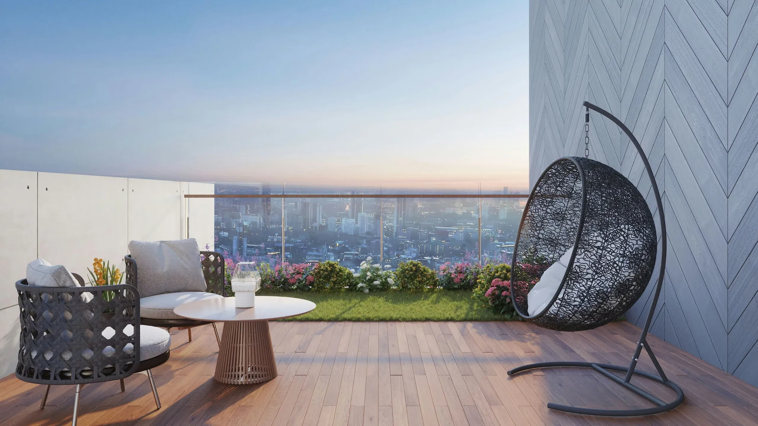
Rooftop terrace with a hanging egg chair overlooking the city at dusk
get started

Your next address starts here